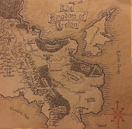
There are few things that make a fantasy world feel more real than having a map that looks and feels authentic. Looking at a map really ignites a player’s curiosity and makes them want to explore each and every place marked on it. A good map can add a lot to make a tabletop RPG feel more immersive. It also lets the players get involved in acting out something that their characters would actually do, which is to look over the map as they travel.
There are many different styles of map that you can make, but for this article I’ll be showing you how I made a map that looks old and worn, like something that might have seen a lot of travel and use. If you want to make a newer looking map, you can just skip some of the steps that I use to make the map look aged. I’ll go over different illustration methods that can be applied to any type of map that you want to make.
Choosing the Paper
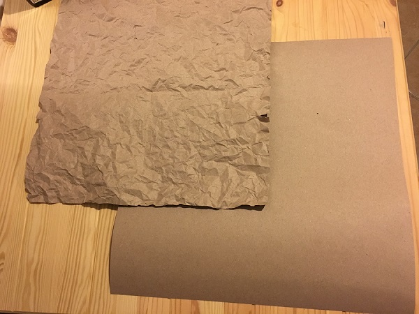
First of all, you need some paper. You could buy a sheet of paper that fits the exact dimensions of how big you want your map to be, or you can get a big roll of paper and cut out whatever size you need. If you’re going to be making multiple maps, then I suggest you get a big roll of paper so that you can just cut out pieces as you need them.
Then there’s the issue of what color paper to buy. Keep in mind that if you’re playing in a medieval setting, the paper-making technology that they used isn’t as advanced as what we have today. White paper was expensive to make and highly prized, as bleaching methods weren’t developed until the 19th century. Most paper was light-brown or gray in color.
This isn’t to say that you can’t use white paper for your map. It will just look like a very expensive, high-end map in a medieval setting. If all you have is white paper and you want it to look darker, then there are ways you can stain it. I’ll go over that more later in the article.
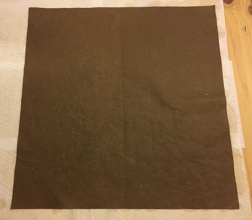
For the thickness of the paper, I would suggest using a pretty thick paper. Thicker paper will make your map feel more durable and realistic, and it will also make it less likely to rip. For my map I used a light brown construction paper that came in a big roll. I think that construction paper is a good choice because it’s not too expensive, and still plenty thick enough. You could use card stock, which would be much sturdier, but also more expensive.
To Crumple or Not to Crumple
For my map, because I wanted it to look old and used, I crumpled it up as much as I could and then flattened it back out. This loosens up the fibers of the paper and makes it more flexible, and also gives it an older look. Once you do this, the paper will be much softer and will bend easier without leaving creases.
It might seem like too much at first, but in later steps when I soaked the paper in tea and coffee, it flattened out a bit more after it dried. A lot of the wrinkles still remain though, and the end result is much more supple than the sheet I started with.
If you don’t want this old and worn out look, then you can completely skip this step. I know some people will prefer a clean and crisp looking map, in which case this step is not necessary.
Staining
To give your paper an even more antique look, you can stain it with something like tea or coffee. This really helps if you start with a white paper, but the effects are much more subtle on brown paper. As for the type of tea to use, I’d suggest black tea. I used regular old Lipton tea, and it worked very well. The longer you steep the tea, the darker the stain will be, but it also depends on how long you soak your paper in the tea. Coffee works pretty much the same, but it will stain darker than tea.
To soak your paper, you can pour the hot tea or coffee into a plate or a wide bowl. Then I folded it up into quarters so the whole thing would fit in. If you don’t want to fold your map, then you can stain it in sections. I recommend soaking the paper while the liquid is still hot, because that seems to stain the paper better than if you use cold tea or coffee. To get an idea of how long you should soak your paper, you can test out a few scrap pieces first. That way you don’t end up staining your final map darker than you want. I soaked my paper for just a few minutes.
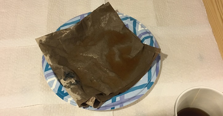
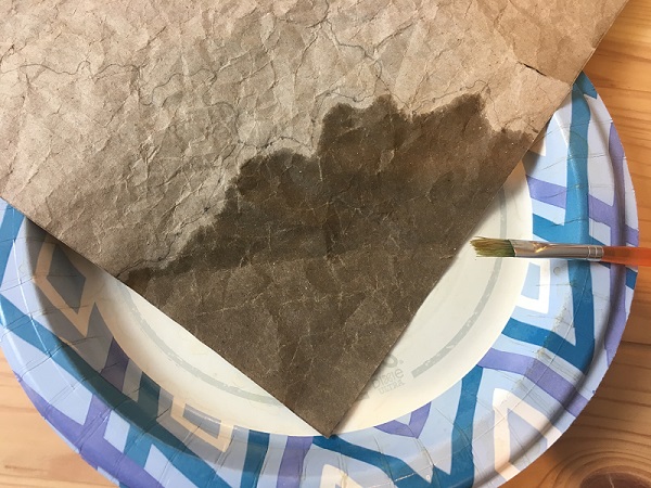
If you want your paper to look splotchy and uneven in color, you can soak some areas and not others. You can also sprinkle the tea or coffee to make little flecks of stains. Another trick is to set wet tea bags on certain parts of the paper that you want to be darker. For my map, I brushed coffee onto the ocean areas so that they would be darker than the land. If you use a brush, make sure not to brush the liquid too close to the border, because it can continue to soak through the paper after you apply it. You can experiment with all these methods until you get something that you like.
After you stain the paper, it needs to dry out. What I did was lay out a bunch of paper towels and then set the wet paper on top of them. Then I took more paper towels and pressed them over the paper until all the excess tea was soaked up. You can use any kind of towel to do this. Then I draped the damp paper over a rack, and turned on a fan nearby to circulate the air. You could just let it air dry, it would just take a bit longer. With the fan on it only took about fifteen minutes to dry.
After the paper dries, it might be warped or weirdly wrinkled. If that’s the case, then you can set some heavy books on top of it, or anything flat and heavy to flatten it back out.
Pens and Ink
The type of pen that you use to draw and write on your map makes a huge difference to the appearance and style. If you want your map to have an authentic medieval look, then it helps to use a pen that writes in a similar way to a medieval quill. Medieval quills were of course made from bird feathers, but unless you want to buy a real quill, or make one yourself, there are some modern alternatives.
I think that the closest type of pen to a quill pen is probably a dip pen, so called because you have to dip it in ink. These are used for calligraphy and can have a very flexible nib, which is the metal tip of the pen. The flexible nib makes it so that when you apply pressure, the stroke of the pen becomes wider. This makes for a good variation between thin and broad strokes, which is similar to how quill pens wrote.
Then you have fountain pens, which can still have flat nibs, but don’t usually flex as much as dip pens. You still get variation between the thin and broad strokes, but not nearly as much as with a dip pen. However, these are often much easier to find in stores, and in my opinion they’re easier to use because you don’t need to keep dipping them in an inkwell. For my map I used a fountain pen and it was perfectly adequate, although it is hard to write very small letters with it. The ink tends to flow very easily and so if you try to write a very small word, it can all blend together and turn into a blob.
For very fine details, like small words or drawings, I used a finer fountain pen with a round point. You could even use a ballpoint pen. It’s definitely not authentic to a medieval setting, but I found it necessary to make those details. I imagine that medieval scribes would make finer point quills for detailed work, so it’s not all that different.
You can also get different color inks for whatever kind of pen you decide to use. I think it adds some nice variety to a map to have a few different colors, like red and blue, instead of all black ink. It also makes sense to use different colors for different things, like blue for water, or green for trees.
Different Styles of Illustration
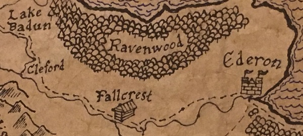
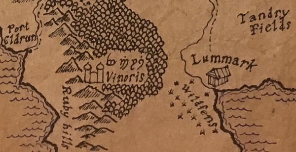
Before it comes time to draw out your map, I think it helps to get some inspiration first. You can look online at a bunch of different styles of hand-drawn fantasy maps and try out the different techniques of drawing things like forests, mountains, rivers, and landmasses. That way you’ll get an idea of what you like or dislike, as well as what you’re capable of drawing. Some techniques are much more detailed than others and require a lot more time or skill to draw.
You might even want to make a rough draft of your map on the same kind of paper that you’ll use for the final product. In my case I made two sheets of paper of the same size, using the same crumpling and staining process, and used one of them as a practice map. This also lets you figure out the layout of all the names and symbols that you want to put on your map. If your map has a lot of words and names, then it can be difficult to arrange them so that nothing overlaps.
I recommend you look at the maps by J.R.R. Tolkien, which was one of the biggest influences for my map. There are also videos on Youtube about drawing fantasy maps that you can watch. If you have any favorite fantasy books, you can check to see if they have any maps drawn in them. Then of course there are historical maps, which can be very elaborate sometimes.
Medieval or Fantasy Fonts
When it comes to the words and names on your map, you have to choose how you’ll write them. Modern handwriting might look a bit out of place in a medieval setting, so I think it’s good to use an old-fashioned or fantasy type font. If you just search online for pictures of medieval or fantasy fonts then you’ll get plenty of results, and then you can just use one that you like.
Alternatively you can look through the fonts of whatever software you use to write documents on your computer. They usually have tons of fonts stored in them, and some of them would look pretty good on a fantasy map.
A lot of times in medieval writing, some letters or words would be written in a much more elaborate font than others. Things like titles, or the first letter of a chapter, would be in a different style than the rest of the words. You could do something like that for the title or heading of your map, and then use a simpler font for the labels of towns and places. I did this for my map, and I think it makes it look more interesting.
If there are any names of places on your map that come from a different language, like elvish or dwarvish, then you might want to write them in those languages. If your map is for a roleplaying game like Dungeons and Dragons, then check the rule books and see if they have any alphabets for different languages. Alternatively you could use the languages developed by J.R.R. Tolkien, which is what I did. You can find a lot of information about his languages online. In a future article I’ll explain more about writing in Tolkien’s elvish.
Direction and Scale
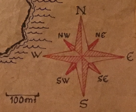
Most maps will have what’s called a compass rose that shows the directions on the map. These can be as simple as an arrow that points north, or much more artistic designs. If you want an elaborate compass rose but are afraid that you don’t have the artistic ability to draw one yourself, then you might want to consider going on a website like Fiverr.com and commissioning an artist to draw one out for you. It would probably only cost less than ten dollars, and you would have a beautiful compass rose that you could trace onto other maps if you wanted to. They could also tailor it specifically to your setting.
Maps also usually have an increment marker that tells you the scale of the map. This is usually a little bracket that shows how many miles or kilometers is in a set unit. For instance, an inch might equal a hundred miles on the map.
Decoration
There are many ways to add decoration to your map. It really comes down to what you want and how creative you want to get. The possibilities are really endless, but I’ll go over some ideas that you might like.
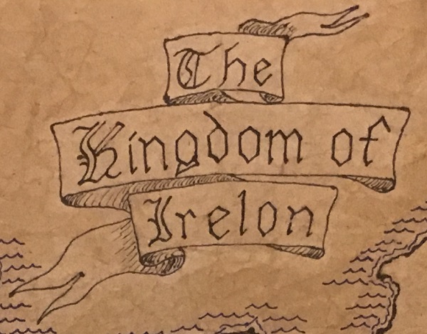
For the title of your map, you might want to add some kind of background to the words. This could be a shield, or a flag or banner of some kind. For my map I drew a scroll design for the title words to sit in. There are many types of scroll designs that you can use. Some are more like a sheet of paper with curled up edges, and others are more like a long scroll, like mine. You can search for images online to get inspiration and find out what will work best for your map.
For the ocean portions of your map, if you have any, you can draw things like waves or ships. The waves can be as simple as wavy lines, or more detailed. The ships as well can be little boats or fully rigged ships. It all depends on what you can draw. For my map I just drew little waves because I don’t think I could draw a very good ship.
You could also put a border around the edge of your map. Just a simple striped line around the edge can make a big difference. Alternatively you could draw a design that relates to your setting, like vines or runes.
Conclusion
I hope that this article has given you some ideas for drawing your own fantasy map, whether it’s for a game or a book that you’re writing, or anything else. Feel free to copy any of the designs or styles that I used for my map, if you want to. Remember that drawing is something that will improve the more you practice it, so don’t worry if your first map doesn’t turn out as well as you wanted. The next one will probably be better.